
Courage and innovation: SB Software’s bold rebrand unveiled
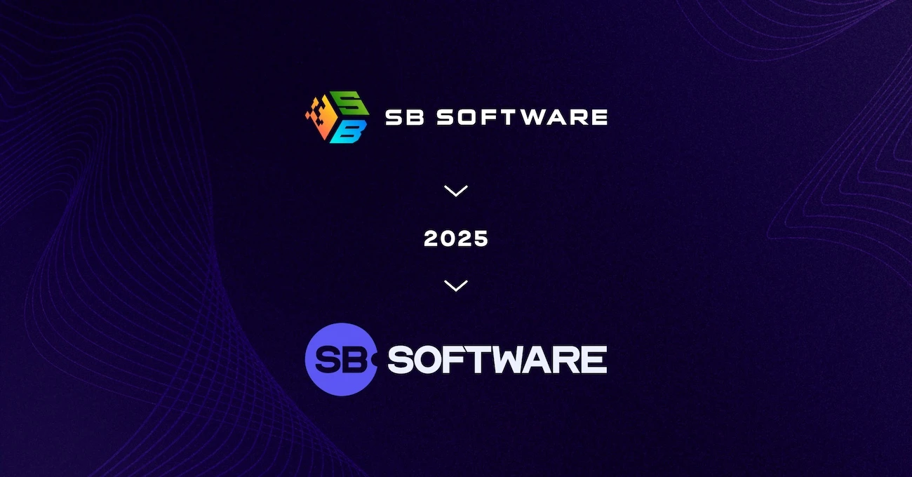
SB Software has unveiled its bold rebrand, showcasing a sleek logo, vibrant ‘blurple’ tones – a blend of blue and purple – and a fresh corporate identity. This transformation is more than a graphic update; it’s a statement of ambition and leadership in the dynamic igaming industry.
A few years ago, SB Software was known for its technical excellence – reliable, precise and effective. But in a fast-moving world where technology and emotion intertwine, innovation demands more than just technical expertise. It requires courage and the readiness to set new industry standards.
A defining moment
The rebranding process began with ambitious brainstorming sessions and meticulous attention to detail. From selecting colours symbolising courage and modernity to creating a logo that bridges SB Software’s future aspirations with its longstanding vision, every step reflected the company’s dedication to innovation.
The result? A minimalist logo with sleek lines and a blurple colour palette, capturing the depth of blue and the energy of purple. “This design embodies our DNA – passion, modern technology and expertise,” said Filip Sosnowski, CEO of SB Software.
Why it matters
“This isn’t just a new logo; it’s the beginning of a new chapter,” Sosnowski explained. The rebrand reinforces SB Software’s mission to deliver solutions that inspire, innovate and give clients a competitive edge. The refreshed identity, including a redesigned website and updated communication style, highlights the company’s core values: commitment, energy and expertise.
The rebranding also emphasises industry trends. “Our new logo and the sb.software domain reflect our vision of the future – focused on social features, player competition, gamification and esports betting,” said Wiktor Garczyński, CPO.
Inspiration from industry leaders
SB Software’s rebranding mirrors recent transformations in the igaming industry. For example, Unibet modernised its logo with vibrant green tones, William Hill adopted a cleaner font while maintaining its iconic colour scheme and 888 Holdings embraced a dynamic gradient design. Each of these updates demonstrates that rebranding is an investment in the future, customer trust and market positioning.
Beyond the logo
“This transformation isn’t just visual,” said Wojciech Trzaska, CCO of SB Software. “It’s a reflection of how we communicate, how we’re perceived and our vision for the future. It represents an internal shift touching every aspect of our work.”
The rebrand signals SB Software’s readiness to take on new challenges. With a focus on intuitive solutions, advanced technologies and exceptional collaboration, the company is set to redefine standards in igaming.
SB Software’s new identity says it all: “We’re ready for more.”
Visit SB Software’s new website: https://sb.software